The challenge was to create a comprehensive redesign of an existing brand. The New York Jets is a NFL franchise that has gone through many logos over the years. Their current design was cluttered and outdated with colors that fall flat.
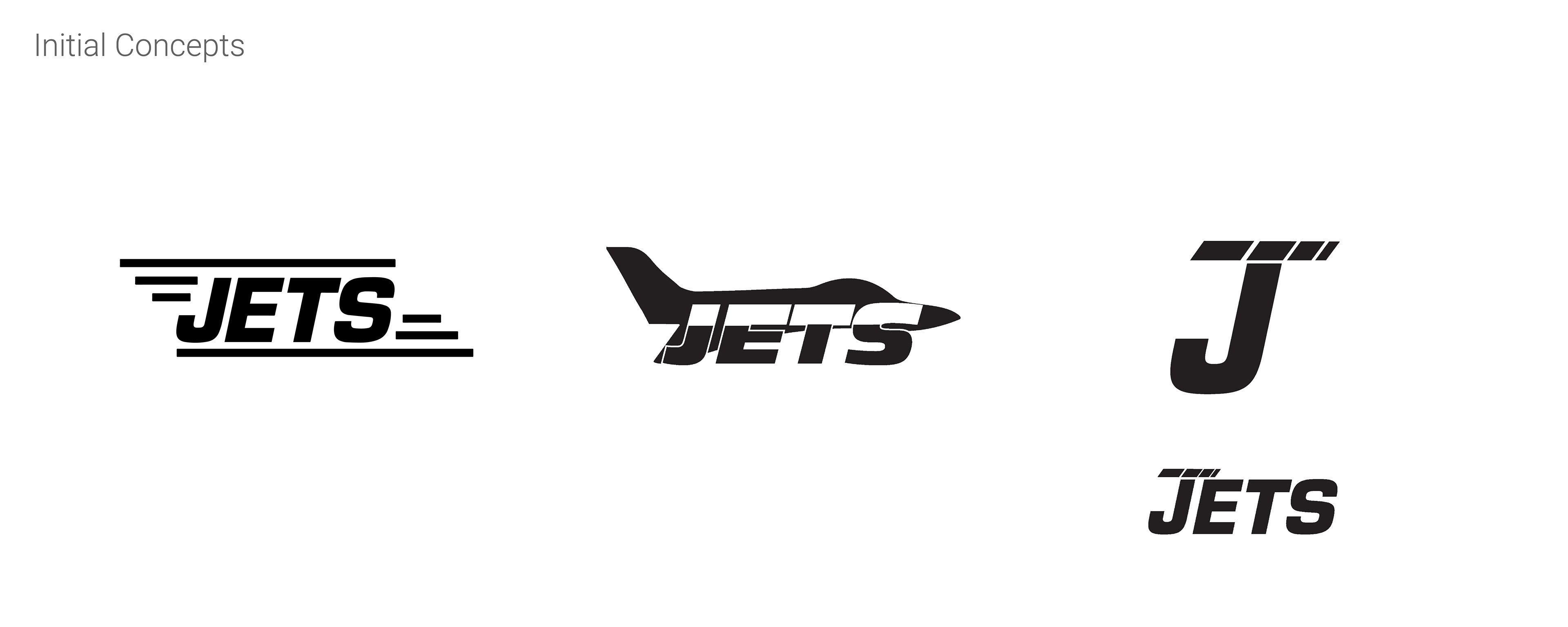
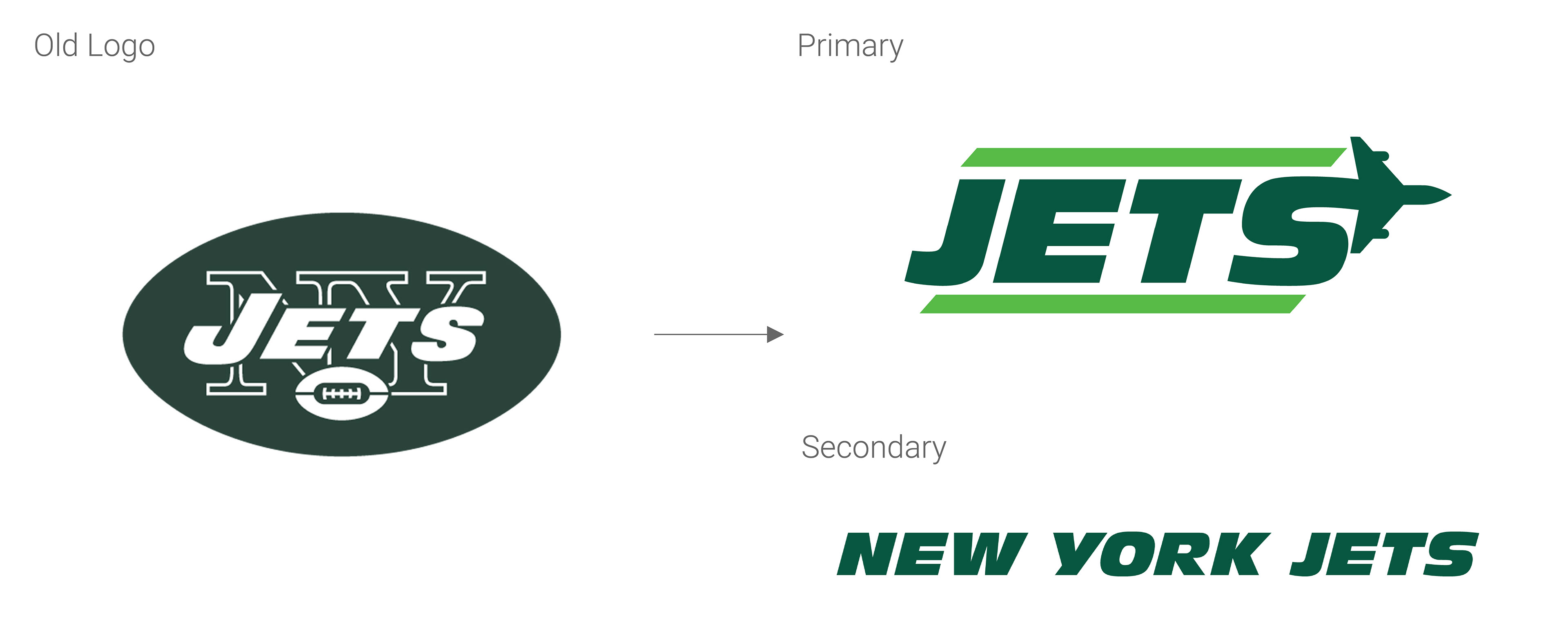
The rebrand needed to keep the integrity of the team history and colors, while becoming more modern, energetic, and streamlined. The first decision was made to keep “Jets” as the primary logo and the full team name “New York Jets” as the secondary logo. This name convention was put in place throughout this rebrand since the team is commonly referred to as “The Jets” and they are actually based in NJ.
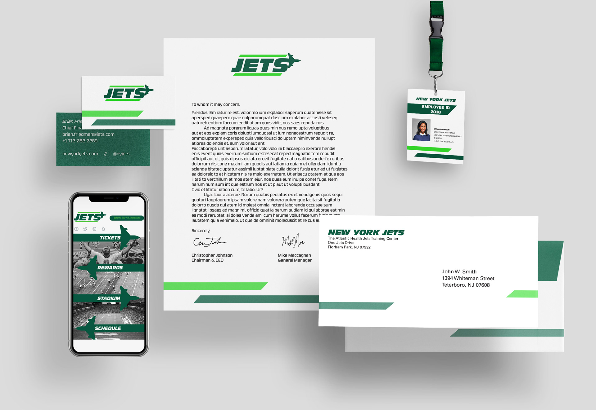
Stationery Set, ID Badge, Team App
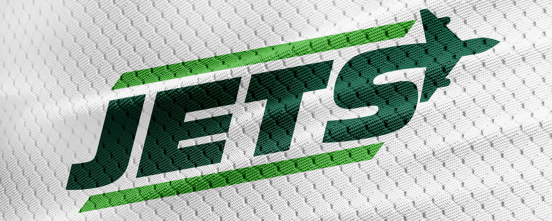
The choice to introduce a secondary lime green accent color adds the dimension and excitement needed to stand out amongst other NFL logos. The imagery of the jet is a nod to the retro logos of the team’s past in a fresh, new way that adds movement. Eurostile was the chosen typeface to span all team documents, signage, promotions, and other marketing materials, particularly for its geometric and masculine construction.
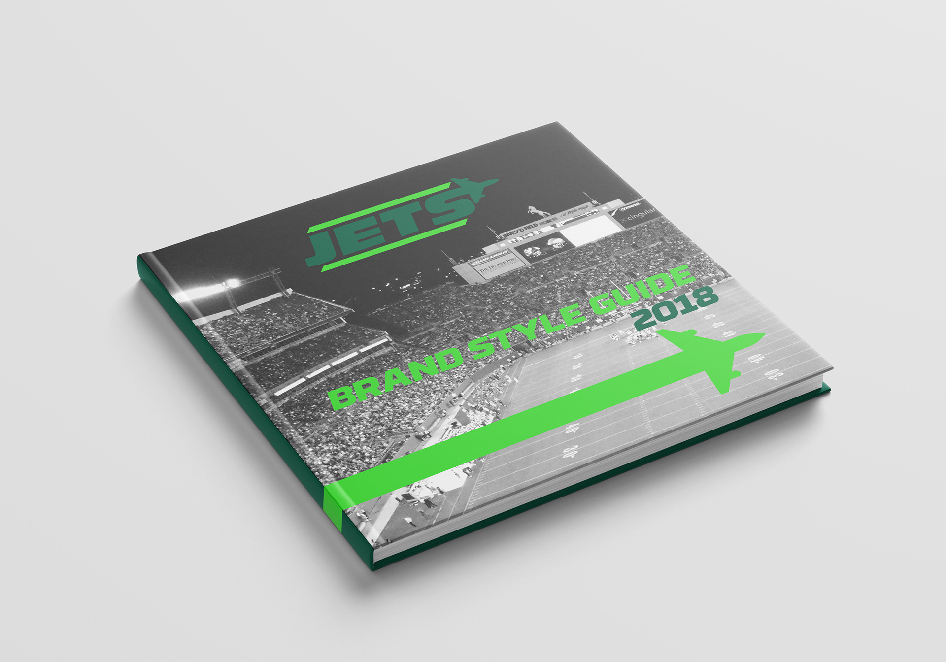
Brand Standards Manual Cover
Intro Spread
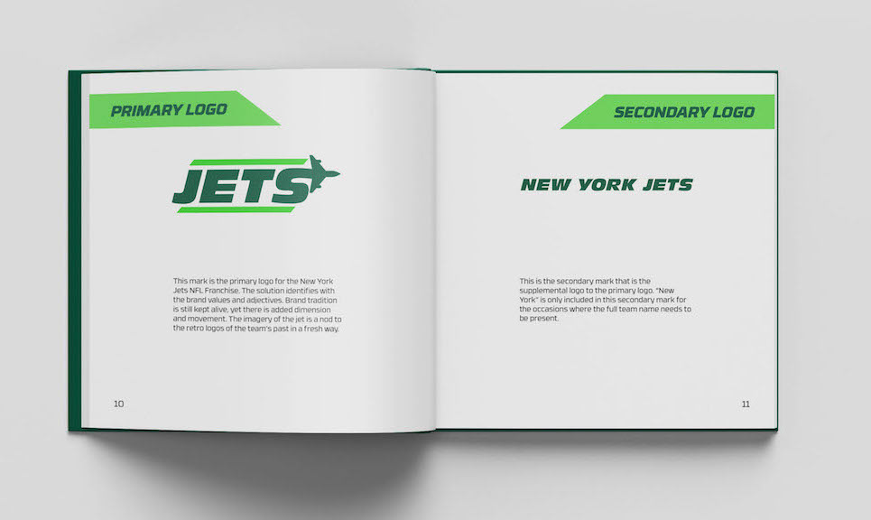
Logo Spread
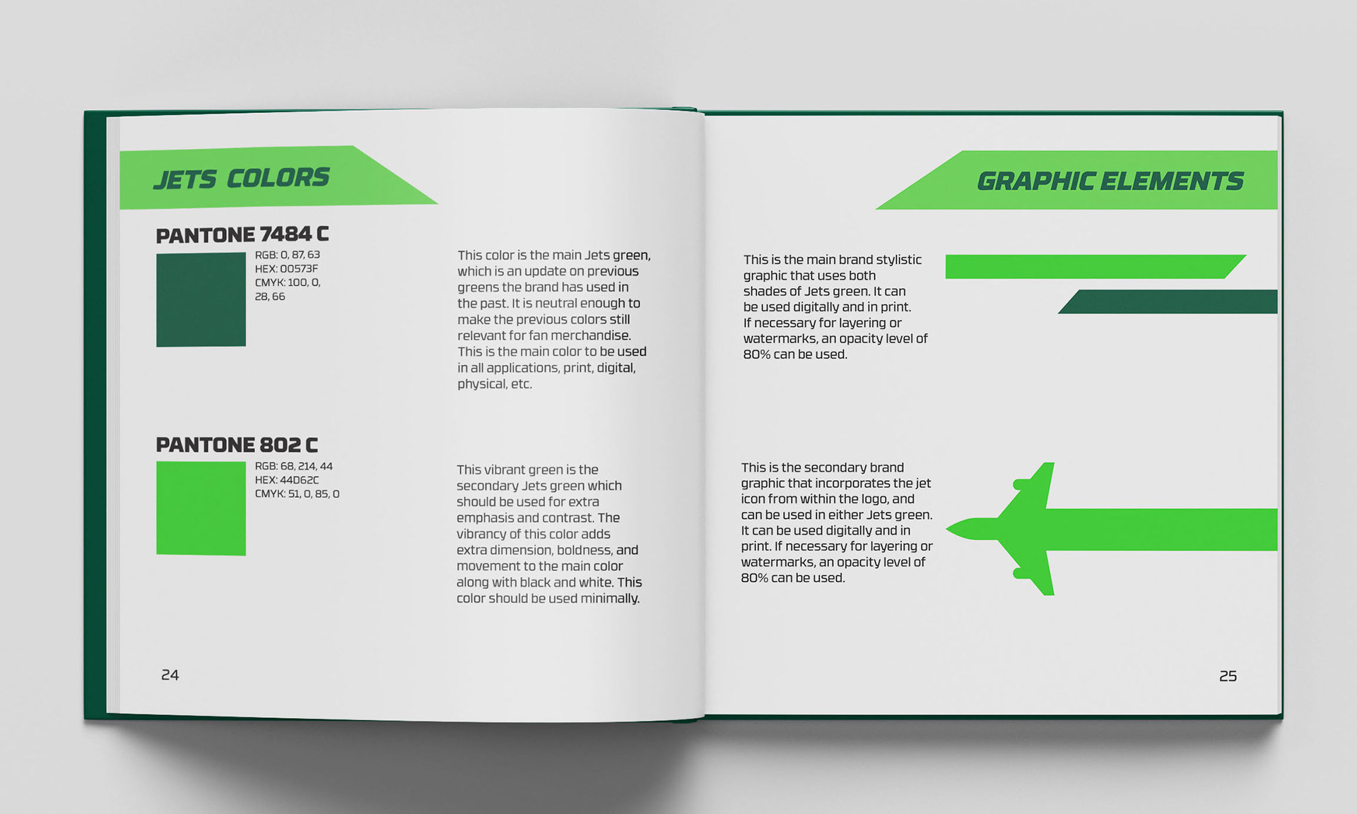
Color and Icons Spread
A final styleguide was designed with specifications on the brand history and values, logo, color, typography, and photography, in addition to elements such as digital applications, uniforms, event signage and more.
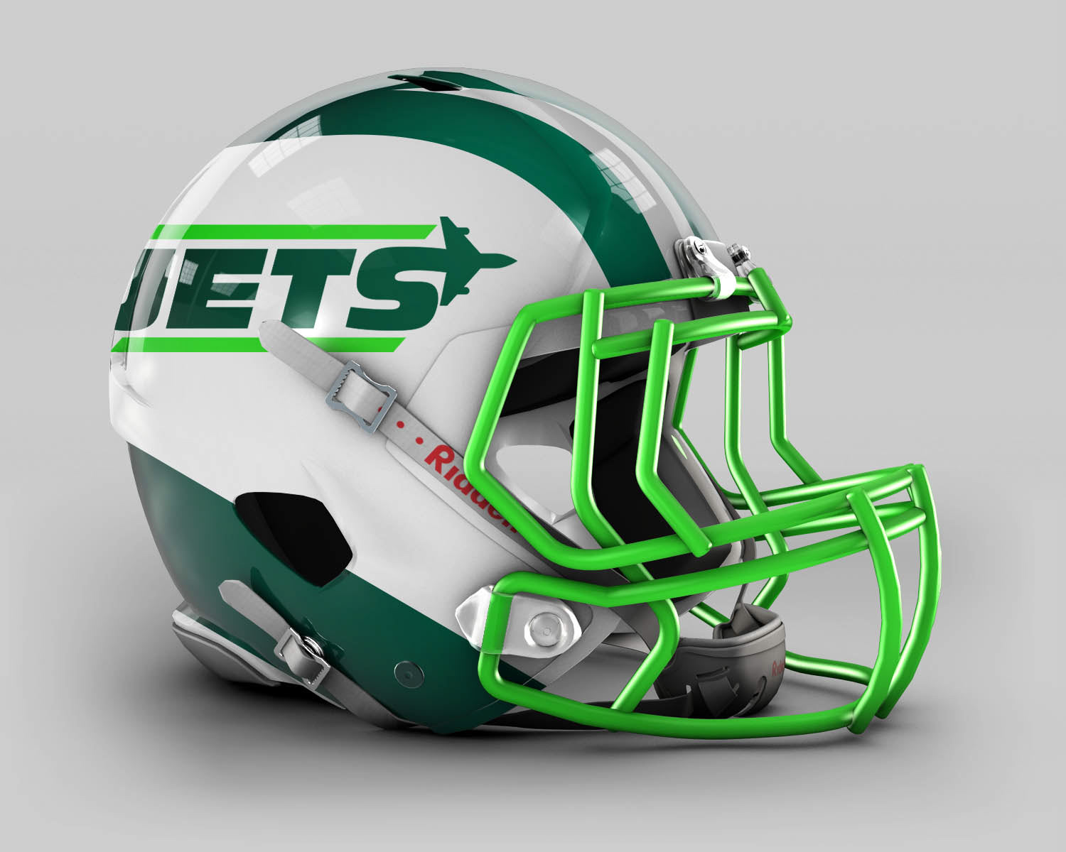
Reimagined Helmet Design
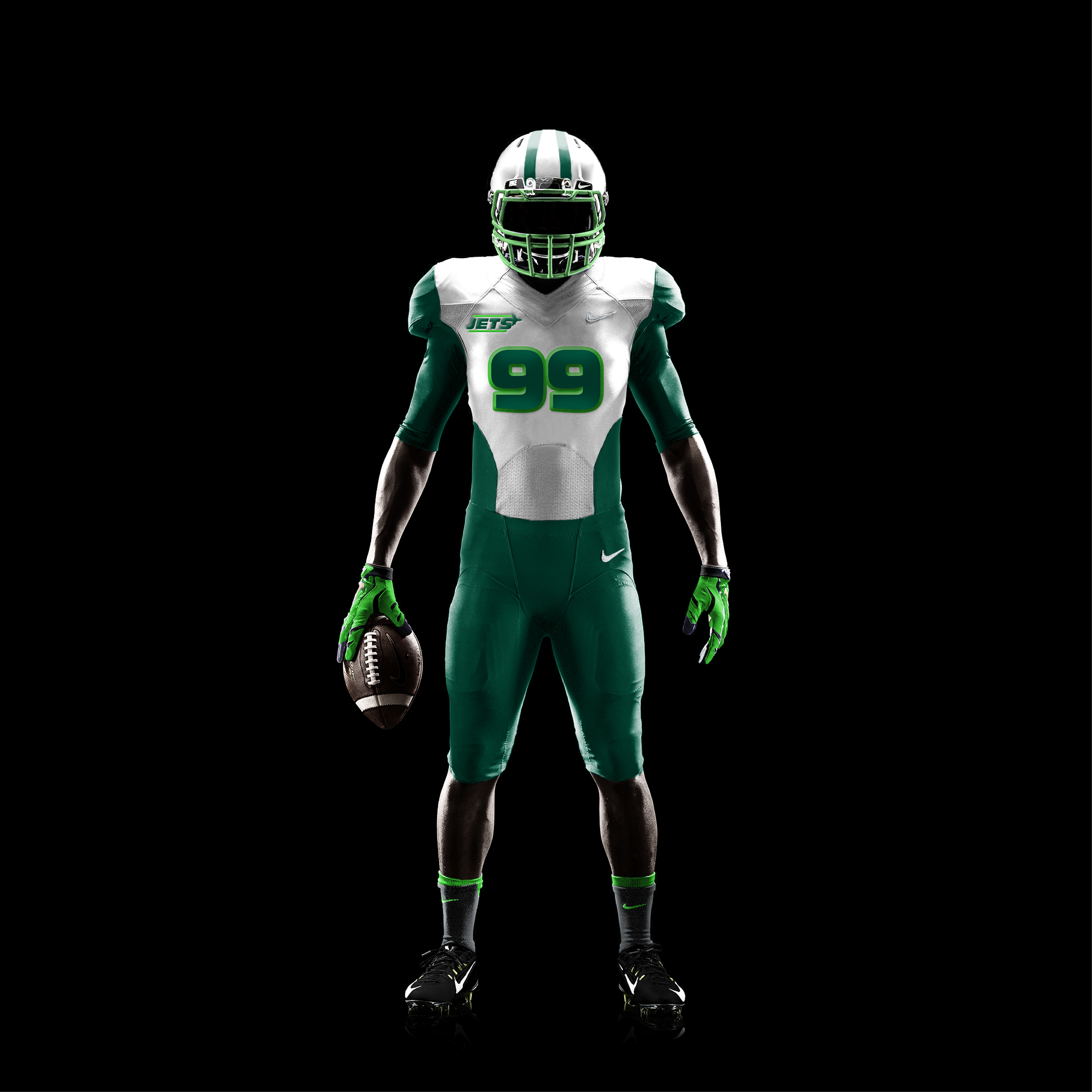
Reimagined Uniform Design
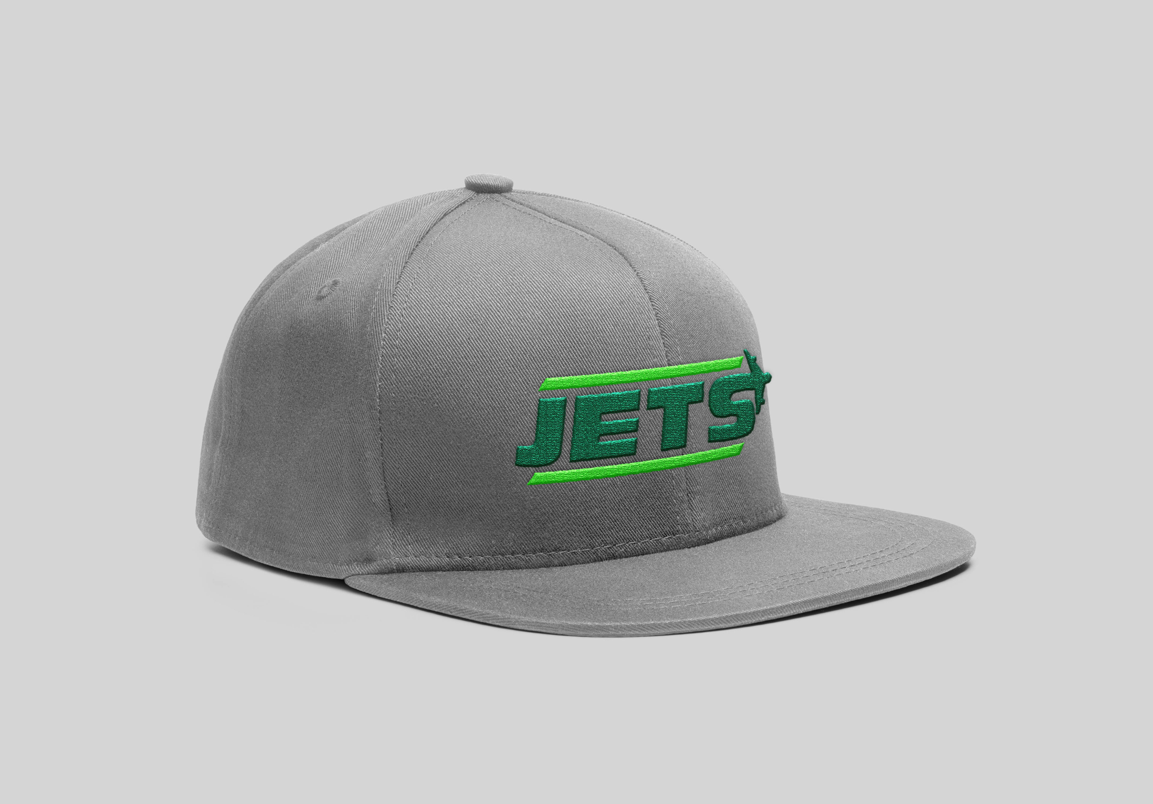
Fan Apparel
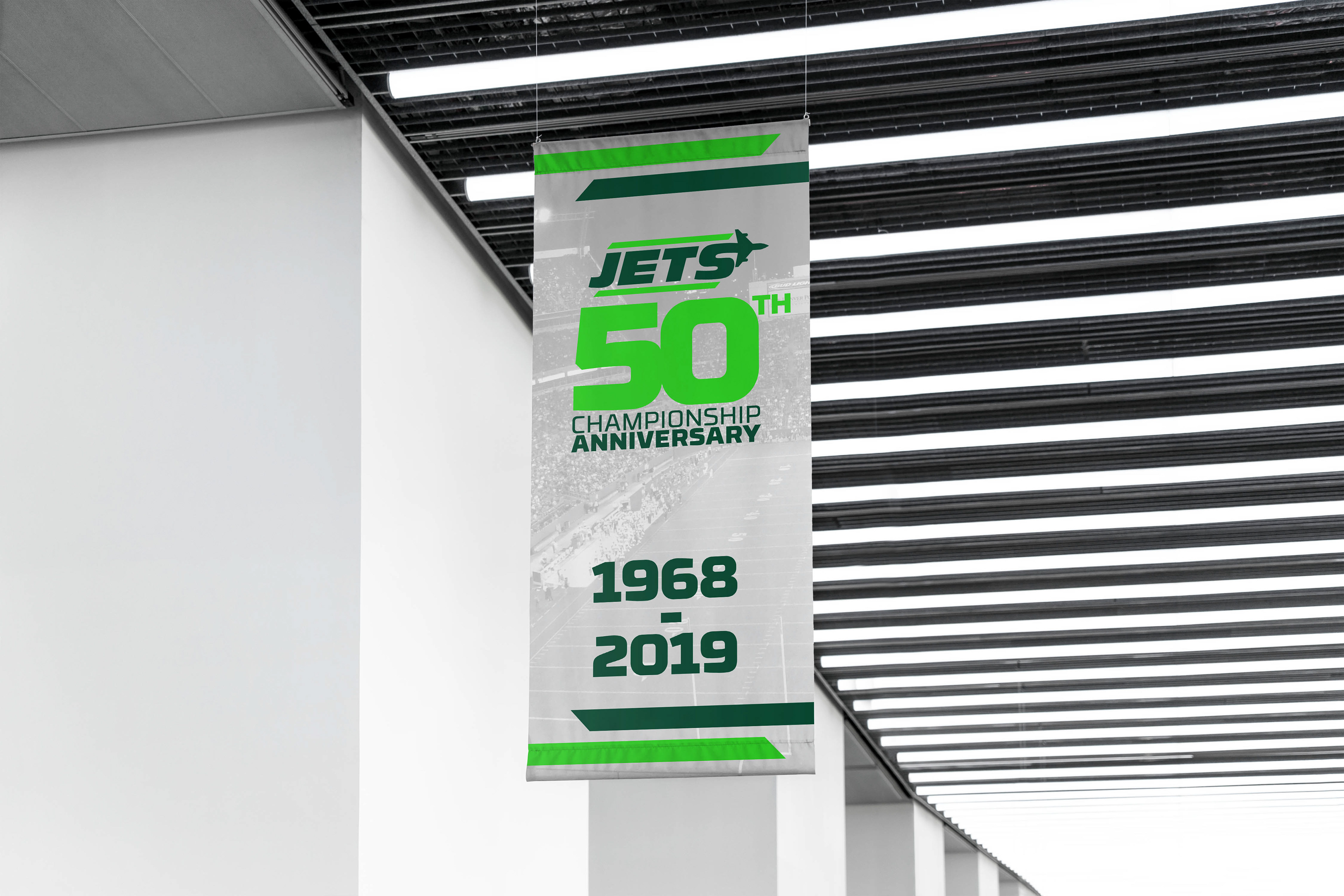
Special Event Signage
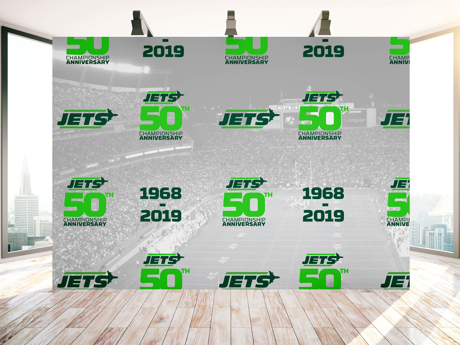
Special Event Photo Backdrop
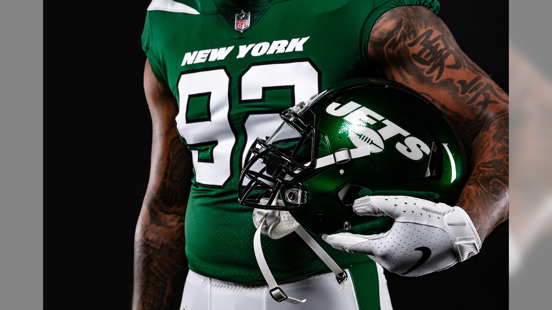
Courtesy of NFL
In 2019, about 6 months after this rebrand concept, the New York Jets team did refresh their team branding and uniforms. They took their old kelly green color and chose a brighter green, similar to my chosen primary green, with black as their accent color. Their new logo also features only “Jets” in a similar bold, italic typeface. The new team unveiling can be seen here.